Saturday, 21 May 2011

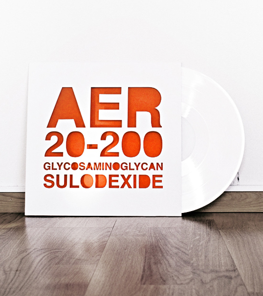
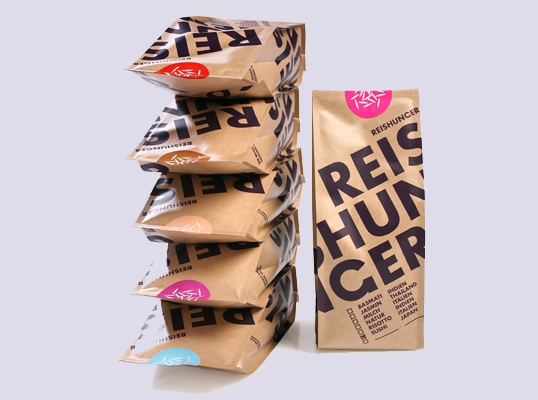
Speaking From Experience: AER20-200


This is the effect I wanted to create with the positive and negative spaces on the front card for my lanyard.

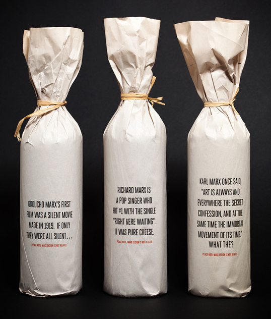
What is Graphic Design// Type Driven: Marx Design


WHAT// Marx Wine packaging.
WHO// Wine purchasers. 
WHERE// Wine sellers. Audience interact with packaging by reading the statements. 

What is Graphic Design// Image&Type: Funny Paper3.


WHAT// 'Portfoliarchiv': Design for an exhibition of contemporary art in Vienna.   
WHO// People interested in the exhibition.
WHERE// Online. Audience interact through browsing the site.

What is Graphic Design// Type Diven: Funny Paper2.


WHAT// 'Places of Worship' catalog for the artist Andreas Duscha.
WHO// The religious one out there!
WHERE// Places of worship ...to acquire knowledge. 

What is Graphic Design// Image Driven: Funny Paper.


WHAT// Peter Kogler catalogue for Museum Moderner Kunst Vienna. 
WHO// Visitors of the museum who wish to purchase merchandise. 
WHERE// Available for purchase in the museum. 

What is Graphic Design// Image Driven: Spencer Bigum


WHAT// 'Music on Paper' promotional Calendar for Atlanta Symphony Orchestra. '12 experiments that attempt to re-think the way we visualise music.' Capturing music as a visual rather than audio and the artists interaction with the instrument.
WHO// Music and art lovers. People wanting a bright and cheerful calendar.
WHERE// Sold in shops. Used as a calendar. 

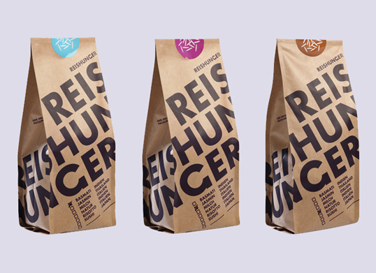
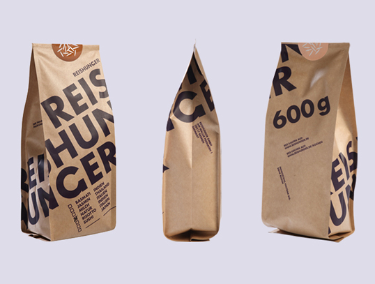
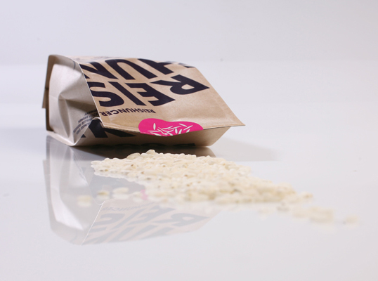
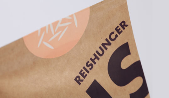
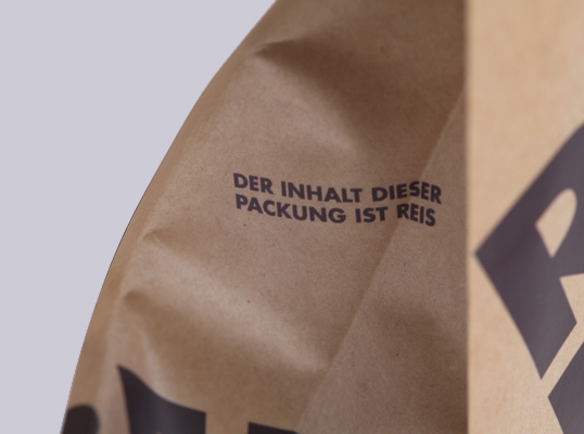
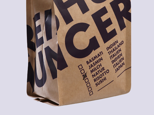
What is Graphic Design// Type Diven: Funny Paper.


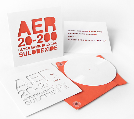
WHAT// Packaging for Reishunger rice. 
WHO// Consumers of the brand.
WHERE// To be sold in supermarkets. Bold type catches audience and creates intrigue.