I have used this book to help me plan my 'exhibition catalog' style book I am going produce in order to explain the logic behind my designs.
Monday, 31 January 2011
Indie Publishing: How to Design a Book.
I have used this book to help me plan my 'exhibition catalog' style book I am going produce in order to explain the logic behind my designs.
Exhibition Catalogs from Leeds College of Art.
I asked at the exhibitions office in college to see if they had any spare exhibition catalogues&this is what they came back with.......
I really like this simple fold out poster format, it is a visual yet informative and is something which I could easily produce within my own body of work.
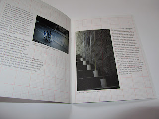
I sincerely love this one; the use of red graph paper had me lured in straight away, not forgetting the riveting binding involved.
Another simple design layout. I especially like the cover design.
Now this one isn't very informative but the visuals speak for themselves I suppose.
.....some very useful and intriguing references here.
This has been set out in a very simplistic manor using only 2 colours. However, it is this that helps the audience to easily grasp the content.
I really like this simple fold out poster format, it is a visual yet informative and is something which I could easily produce within my own body of work.
This one is interesting... the bold use of red really draws you in and the images create high interest.
I sincerely love this one; the use of red graph paper had me lured in straight away, not forgetting the riveting binding involved.
Another simple design layout. I especially like the cover design.
Now this one isn't very informative but the visuals speak for themselves I suppose.
.....some very useful and intriguing references here.
Subscribe to:
Comments (Atom)


