This is the website design for a student festival; Summer Break. The colours attract the attention and the visuals draw you in whilst the layout design eases the legibility.
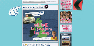
All Over the Place
My brother was watching this CBBC show when I noticed the graphics, so looked it up. Once again, the combination of graphical and photographical elements has caught my eye.
I am drawn to the hand rendered element within this ad.
What a use for good ol'lego!!
The way the wall art comes alive and interactive is immense.


No comments:
Post a Comment