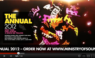
I want the first part of my MoS logo to come toward the screen in a spinning motion like this cd box does.
I have also begun to think that an image of a cd box could be quite fitting for my cd case design, I could then contain a cd in a sleeve within it.
Using the logo and keep switching back to it is another take I could go for.
The make up/break up of the MoS logo as a focal point to which the music is played behind and gradients in motion can be applied behind also.
Leaving the type in the same position and just moving/affecting the logo could be a way in which I take this title sequence.
This little montage of MoS moment has provided me with some ideas of transitions and information to include in my sequence. This is what I found...
Quick unfocused movement of letters which then come into focus when stop moving.
Simple type. Left on screen enough time to be read.
Use of logo to represent where they are in their musical progression.
Type revealed from left to right.
Twisting motion applied.
Type only truly revealed when type all in place.
Letter being emphasised by a change in size.
Logo moves towards screen to end sequence.
I have realised that many of the MoS advertisements for the compilations don't have much movement on them.
This is another example of how little some of the motion is and the loop that occurs.


No comments:
Post a Comment