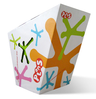
The use of bold type within a small space within an area of solid colour is effective. Your eye is drawn to the type yet the empty coloured space allow the mood/tone of voice to be set.
It is interesting to see how the geometric shapes present within these pieces of packaging interact with one another. The use of colour within each geometric shape and how they interact with one another and in relation to the packaging shape is also of intrigue. This use of colour within geometric shapes is something which I could explore further within my motion graphics.


No comments:
Post a Comment