This calendar shows the hours of light and darkness in London throughout the year. Reflective inks and phosphorescent inks have been applied to reflect the data. This print has been digitally printed and then had these inks applied, however, if the print run were to increase the calendar would then have to be litho printed and the reflective inks added on afterward.
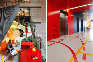
All little more to this graphics than your usual printed graphics, but it just goes to show the different contexts graphic design can appear in. Some of the mounted signage will have been laser cut, the imagery present on the floor will have been vinyl stickers and the information present upon the stands will have been either printed directly onto the stand or vinyl cut and stuck on.
The geometric UV varnish used on the cover of this book design hints at the contents of the book. I really like the way in which the colour used on each of the left hand pages corresponds to the colour seen on the right. These are most likely spot colours that have been used.
The cover of this publication has been litho printed then die cut and embossed. The orange and white work considerably well against the black background. The edges of the publication have been die cut to become rounded rather than pointed. The cover has been printed on a coated stock and the inside pages printed on an uncoated stock.
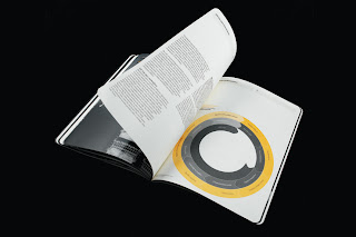
Target Audience: those with an interest in infographics/ Government visa stats.
Context: A government document supplied to people with an interest in politics.
Vinyl wayfinding is present in and around college. This would most likely be digitally printed then vinyl cut and adhered to the surface. This type of print will usually only have a small colour palette as its purpose is to inform not identify.


No comments:
Post a Comment