Tuesday 20 December 2011

Publications


I love the colours used within this publication. It is a simple 3 colour piece, but it work significantly well; it is vibrant yet basic.

Saturday 17 December 2011

ITV Idents


Using the screen shots present upon this website I constructed this gif animation of the ident.
These screen shotted idents will prove useful when it comes to designing my own ident as it gives me some initial ideas of how objects can move or change. It also allows me to see what can be achieved within the time available to me. 


Monday 12 December 2011

HMV BOOM!


This is an example of how this effect can be used to advertise in the real world; it has been used here to highlight 'smashing' prices HMV has to offer. It is a simple concept which appears very effective when it is executed on a high level. 


3D Text Reform


Although these have most probably been made in Cinema 4D, the concept behind it is the reverse of the action I want to create for my word 'disperse'. The slow deconstruction of the letterform into random pieces which can then disperse into the atmosphere is an area which I have look at creating through my storyboarding. The motion graphic I have produced so far this deconstruction occurs at a much faster pace, due to the 5 second time allowance. However, I want to try this on a slower timescale with one of my letterforms.


The concept of the letterform dispersing then the particles hitting a surface as seen here is an addition I could include within my design if I were to find out how to do it in after effects.  

6Pixel


The way in which the camera is angled and moves around the letterform in a 3 dimensional manor makes the artwork really come to life. The camera also zooms in and out to create a sense of intrigue about the letterform; as if the camera is curiously inspecting it. The flashes of light also highlight this.

MTV Ident


The colours used here make this animation SO visually intriguing. Although we are restricted to using only one colour in our animations, I can see how colour can be used to enhance my work in later projects.

It is evident that colour plays a bit role in the majority of their idents...


BBC Ident


This BBC logo appears to be coming at you, however, material flashes on screen before it gets time to reach the viewer.


The BBC one type seems to come together by a ripple effect. I quite like the fact that the type is not present until this movement occurs.

ITV ident


The angle at which the number '1' enters the screen is very effective; it is not clear to the viewer what they are viewing until the number form comes into shot. It is obviously more advanced than what I am looking at creating, but in terms of the movement it is bang on! The camera then moves around the artwork whilst information is being spoke to them by the voiceover lady.


The artwork composition also clearly works with my word 'disperse'.

Rudd Studios

I was researching into the channel 4 idents and found that 'Rudd Studios' were responsible for this. The link below shows short showreel of their work...


The movements seen here is simple, but it seems that it is in fact the developed initial artwork that gives these idents value. The designs are reduced and pure which effectively convey the channel 4 logo.


Anamorphic type.


Starting to think a little about how type can be broken but still appear intact from a front on view. I could use this anamorphic type as a way of dispersing my letterform. 

Movement Typography

I feel I have been looking at a fair bit of kinetic typography which is very similar to one another and uses similar movements. Today, I want to branch out and try to find and identify motion graphics which looks at the use of 3d material with different movements and camera angles... more motion graphics in general, as all of the above can then be applied to a typographic treatment. Target set right there!

Monday 5 December 2011

Vimeo:Kinetic Typography Channel.


The typographic movements within this are quick and punchy. The type layering upon one another work well, then moving away into the distance of the frame. 


This takes a well known viral ad and applies a typographic movement to it. The use of different line weights works considerably in relation to the tone of voice present. 


There is a simple 3 colour palette present here, but a clever one at that. The orange is subtly used to highlight particular words and letterforms in correlation to the importance of their presence within the audio.


This uses imagery within the type and additional to the type relevant to the audio. This helps the viewer visualise what is being said to them in picture format, as well as being able to read the audio.


The colours in this work considerably well in communicating the type. The use of red especially communicates the tone of voice being used within this.


The type within this has been stylised to suit the tone of voice each word takes. For example, when the word is spoken louder, the letterform appear larger and bolder on the screen and when there is a large emphasis on the word, the letterform appear in italics. 


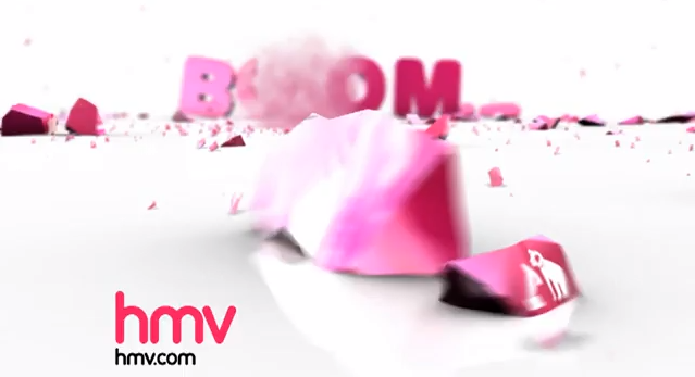
 The way in which the type moves throughout this makes it feel as though it is just the camera moving and not the type. The type also has a 3D effect present which add depth to the overall appearance. 


Each typographic element is presented using a different movement. Each of these follow on well from one another, almost like a dance; you are constantly waiting for the next magical move to appear. 


I think the hand-made element works quite well within this kinetic type, however, I think it could be made a little more clean cut. Also, I think the addition of colour could help enhance the appearance of this.