Wednesday 28 March 2012

Websites


Clear navigation present
Imagery over powers content


..this website is far to neutral and plain with the colouring. Even the logo designs do not have colour present.


far too busy design


very clear navigation.
the way in which the colours change as you hover over each word.
the screen is split into columns which extend as you click further into the content of the web page.


the work here is presented in a similar layout to that of tumblr. The navigation is quite interesting in the way that you can move the bubble to scroll over the net design to scroll down the page.


The top of the page isn't extremely interesting however when you scroll down the page the figure stays in the same position but the clothing changes. 


Wednesday 21 March 2012

Ex-Students Boards

I have looked at a few ex-students boards to see how they present their work, this will then give us an idea of how to present our products for YCN and what content we should include (digital or photographed)

Anand...


Anand presents a standard format along the bottom in clear columns which allows him to include information about the products. Each piece of artwork is numbered and referred to in the information presented. He uses a mix of his digital designs and printed photographed designs, this mix is something I want to present within our boards; these are all aspects of the boards design that we need to take into consideration.

Tuesday 20 March 2012

QR codes

I have come across this website which allows you to create a QR code. We want to use this as a reference point for people to reach our online picker tool which we will propose to be hosted on Fedrigoni's website.....


Monday 19 March 2012

Apple Stencils


We can use the above stencils to demonstrate how our tool will be used across this digital media.

Sunday 18 March 2012

Interactive Colour Swatches


I have come across this interactive tool already available from the app store. It doesn't look very visually exciting, so this is an aspect of the design which we need to consider within our product. 


When you click on the colour at the bottom of this swatch picker, the central image moves to the right to allow the new image to move in. The motion between the colours picked being viewed is something we are going to need to consider.


These are the colour picking tools available within software; they are very simple and keep complimentary colours together in order to make them more visually appealing.

Online Colour Pickers

As we want to produce an online colour picker, I decided to have a look at what already exists....


These are the standard type of colour pickers available online, so we need to create a tool which has much more of a designers feel about it but still does the job of showcasing the whole 262 colours Fedrigoni have to offer.

I am currently thinking that we could either produce a swatch that looks like the paper version but is in actual fact digital (seen as we are promoting paper). Or we could take a paper made product and allow the colour of it to be changed to the colour of the swatches picked.

Multi-Media

The Guardian is one company who has pushed its print based product into digital areas....


...all these apps should be considered as possible applications for Fedrigonis paper colour selector tool.

Saturday 17 March 2012

Sticky Notes and Pencils


As we want to include both sticky notes and a pen/pencil within our pack, I have had a little look. I think using different colours throughout the sticky-note pad could be interesting. We should use Fedrigoni's logo on the underneath of the sticky notes and quote their website as a point of reference.

Friday 16 March 2012

Fedrigoni Contact Details


I have been looking for Fedrigoni postal contact details to allow customers to send the tear out sample form back to this address.

Fedrigoni Type

I have been considering the typeface we are going to use for our Fedrigoni designs today. I have looked back at the typeface Fedrigoni already use on their products and website...


Fedrigoni use a sans serif typeface, non ornamental with the main information in UPPERCASE. Consequently, the type on the exterior of our notebooks should most probably be presented in uppercase.

Re-Visiting Imaginative Colours Tool

I have just re-visited Fedrigoni's Imaginative Colours tool as I was beginning to design the sample request form, however, I did not feel I knew enough about the tool in order to be promoting it. In doing so I realised that we were heading in the right direction by producing products which target graphic designers, as it is again stated within their description of the tool on their website....


I also found that within the tool's four books there are a different number of swatches categorised by colour:

63 Warm Colours: red/orange/yellow
71 Cool Colours: green/blue/purple
66 Neutral Warm Colours: brown/cream/ivory
62 Neutral Cool Colours: grey, silver, black

Therefore, I am now considering allowing the customers to choose which swatch book (out of the above four) they would like to receive rather than having a choice of 262. However, we would have to check it would be possible for customers to order single books as the imaginative colours tool does come at a cost for the whole pack.

The Paperie


Just another quick look into the visual aesthetics of a notepad.

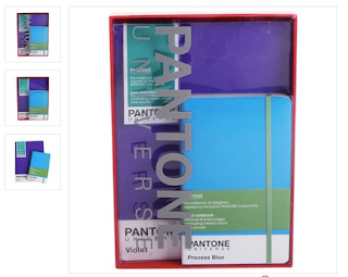
Pantone Notebooks and Sets


These Pantone gift sets comprise of different sized notebooks and sketchbooks, the colours of each compliment each other well. Each of these sets provide the customer with something a little different. We could look at creating a range of different packs, each consisting of different products. In terms of packaging, I like the way it is a simple packaging choice using a transparent stock to allow you to see the contents within. Minimal products but well crafted is what we are after providing our customers with... a creative present!

Thursday 15 March 2012

Packaging

Black metallic padded bubble envelopes


These shiny black envelopes could be complimented by white screenprinted type carefully positioned. I think these would create nice little packages to send to designers; I would certainly like to receive one of these on my desk.