I want to get started on storyboarding my title sequence this morning. I am going to use my top 10 album covers for inspiration with regards to the artwork, but I feel I need to research into existing title sequences in order to get an idea of how I can use the 60 seconds I have effectively and look into different transitional movements I could use.....
The way in which the sound begins before the visuals enter the screen is effective.
The type being reversed then flips the correct way to be viewed when it is wanting to be read.
Type move around screen, remains still when needed to be read.
Use of layering imagery...flashed on/off screen.
Type white against black....creates impact
Movement in time with audio
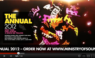
Plays heavily on type. Lit up to give sense of film. Movement of each wording differs. Way enters screen also differs.
(Thinking...I could do this with music associated with the MoS album artwork)
Type enters screen with no sound. Each element of the title sequence is linked via the continuation of lines. Zoomed out to reveal type in full. Slow reveal of smaller type. Soft tone of audio works well with timings and movement of type.
Type left still on screen whilst the background imagery moves. Type appears in different ways ....out of the artwork/in relation to the artwork. Type interacts with imagery (people stepping down type as if its actual steps)
Type based. Same imagery interacting with each piece of type presented (the penguin)
Begins with no sound. Sound then slowly tuned in. Each movement relates to the beat of the audio. Imagery gets more intricate as sound develops.
Use of vibrant colour in titles. Changes in time to soundtrack used. Interesting interview with Olivier; the title sequence has to set the mood of the film, something catchy to get attention, smallest details are important.
I like the way in which the digital interacts with the photographical elements. Each everyday designer is linked to/creates a graphical motion. LOVE IT. I really want to consider something like this for my next brief as it wont work in context with my MoS work for this project.
25 seconds without sound.... sound then gradually introduced. Mainly type based with moving image present in the background.
Type flashes on screen at fast pace. Important words highlighted by the use of a vibrant colour. ....maybe too quick to read?
Type introduced to screen in a top-down motion. No audio. Type begins to curve around screen. Audio after one minute. Again, type flashes on screen to the beat of the audio.
Moving 3D image which has different effects applied to it, then reveals the type. I am thinking I could use this notion within my title sequence and play with the Ministry of sound logo as a 3D image ...manipulate it in time to the audio, then present the title name.
I am thinking this due to the majority of these being very much type based; revealing the names of various designers/artists who have worked on making the film to which it is the title sequence. I don't necessarily have this, so using the MoS logo as the main imagery in my title sequence should work considerably well and produce some effective results.
A handmade/hand drawn element to this. Works well in context.
Dropping down certain letterforms to fit into the word which is to be later revealed. Spoken audio over sequence. Vibrant colours moving work well with the audio being spoken.
Type grows out and links into other type which appears after. Uses the construction of the type to do this.