Wednesday, 28 September 2011

WHAT IS GOOD ..Studio Workshop

Identity/Brand/Logo to support my concept...


What makes it good?


//Provides the process of creating street art
The process involved in creating a piece of visual street art requires specific tools to do so; without them nothing could be created. 

Who would find it good?


//Creatives who want to try a different medium to work in
Artists are constantly wanting to venture into the unknown and explore new mediums; with the knowledge of how others do it via their tools, they can then apply this to their own work.

Who wouldn't find it good?


//Creatives who do not know of or how to use the tools of a street artist
A creative who doesn’t necessarily know of or use the tools of a street artist may be unsure on how they could be used to benefit they’re work.

What is it better than and why?


//In studio work
Street art is produced and left in the public eye ...gets appreciation and recognition (where wanted) whereas work which doesn’t ‘get out there’ into the real work and sits in a drawer in a studio will receive no recognition or feedback from real life people.

If your good was a profession what would it be?


//Advertiser 
The street art produced by the tools may be used for advertising purposes (guerilla advertising).

If your good was a celebrity who would it be?


//Jaguar Skills
A highly skilled DJ who combines best bits into one solid mix using his own unique style, in the same street artists combine different tools and mediums.

If your good was a place where would it be?


//London
A place with a buzzing street art scene.

If your good was a product what would it be?


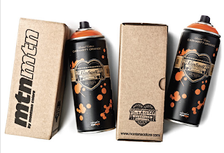
//Spray can
This is a product common to street artists (depending on their specialisation) 

If your good was an event what would it be?


//Street Art Exhibition- Tate Modern
It is becoming more and more common to see a street artist exhibiting their work.

Tuesday, 27 September 2011

DESIGN FOR PRINT//W.I.G ...Askul


The simple use of colour on the pen lids and the simple design of the transparent minimal packaging design that gives these the creative edge.

DESIGN FOR PRINT//W.I.G ...Askul Paper


The simple colour combinations and use of few colours creates a high impact. The pattern is simple yet makes it memorable as it differs from the norm.

DESIGN FOR PRINT//W.I.G ...Koji Minami


'A redesign to increase the functionality and re-use value of the packaging, which displays the qualities of the product itself.'

The way in which the packaging demonstrates the products functionality is a clever selling technique. I particularly like the minimalistic colour scheme.

DESIGN FOR PRINT//Information & Wayfinding


Tate Biennial Report

The embossed design present on the cover of this publication creates a minimal appearance and makes you just want to feel it! The inner pages would have been litho printed.
Target Audience: Those interested in the discipline of art and have an appreciation for art.
Context: Tate gallery museums.


This publication informs viewers of Penguin about their books published between January-July 2001.
The embossed structured type creates interest and makes you read the type out of curiosity. The penguin symbol on the cover design and the inner pages would be litho printed.
Target Audience: People with in interest in the Penguin book collection.
Context: Book stores.


These mugs are PAD printed. They are interactive and allow people to provide information as to how they prefer their 'cuppa' directly onto the mug itself. 
Target Audience: Those with an like/desire for tea/coffee.
Context: With an office/workplace where multiple cups of tea are required to be made.


There is a spot colour used throughout this leaflet, which is promotional material for an exhibition 'WhyBence10' which focuses on contemporary public furniture. Consequently, information has also been left next to pieces of public furniture for people to engage with and read whilst sitting on or interacting with the furniture. The spot colour has also been used on the publication to create a monotonal image. This will have been printed on a 5 bed offset litho.


This pop up exhibition will have most likely been digitally printed, considering it is a rather small scale print job and uses no spot colour inks. It is probably printed on uncoated stock, then encased into the stands. 
Target Audience: Those passing by the area the exhibition is set up/those with an interest in agriculture.
Context: In open public spaces within the city to raise awareness of European agriculture. 

DESIGN FOR PRINT//Packaging and Promotion


The transparent packaging is a great way of promoting the product, the viewer can physically see the product inside and due the bright colours of the confectionary, they create their own patterns. The containers would have been either pad printed or digitally printed stickers stuck on.
Target Audience: Sweet lovers/those wishing to purchase confectionary.
Context: Confectionary stores/general food stores.


These have been printed using either litho print or digital print ...depending on the numbers of runs required, if a larger number of runs are required litho print would be used but if there are only a small number of runs required then digital print would be used.
Target Audience: Those wishing to recycle items.
Creative Context: Within an office where recycling occurs.


These pens and their cases would have been PAD printed. The white works really well against all the colours seen here.
Target Audience: Creative individuals who want use pens within their design. 
Creative Context: Within the design workplace so the pens are accessible for use.


“The packaging design for MoirĂ© were created from the world of the moirĂ© effect phenom – a visual perception that occurs when viewing a set of lines or dots that is superimposed on another set of lines or dots.”

The contrast of the bright colours against the black background or brown paper, it seems to give the produce another dimension and creates great interest. The use of the UV varnish to create a pattern works considerably well as the boxes remain minimal, however, in certain lights the pattern becomes more visible. The typeface used makes it very easy to identify the product and distinguish what it is exactly.


'A packaging concept for HB pencils which doubles as a container and is intended to be displayed on ones’ desk. Considering art and design supplies are largely geared towards creative people it is constantly surprising how dreadful their packaging solutions can be. We’d love to see more of this sort of simple, functional design hitting art store shelves in the future. To solve the problem of mandatory labeling, removable cardboard sleeves could be employed.'

The simplistic look and nature of this packaging portrays complete minimalism, it has literally been stripped back to its purest form, making it highly functional as well as aesthetically pleasing for those creative designers out there. Information can be contained within the packaging should it be necessary for information to be contained.

DESIGN FOR PRINT//Publishing & Editorial


There is a die cut hole in the cover of this publication; it is printed using a variety of different stock options so it is most probably litho printed. The majority of the publication, however, does seem to have been printed on newsprint, therefore would not be high a cost to print. There is also a variation of colours within the publications.


This monochromatic colours on the cover of this publication are simply overridden by the bright orange spot colour present. It creates a significant contrast. This publication is litho printed, it is a publication to mark the 30th anniversary of the school and outlines the courses available, therefore would be a large print job.

Target Audience: those wishing to study at the college, or those who have previously studied at the college over the last 30 years.
Context: handed out in the college/college fairs/promotional material for the college.


The dots on the cover of this publication have been embossed to create a texture to the page. The interior pages have been litho printed or digitally printed depending on the scale of print runs required.
Target Audience: People with an interest in the contents of the book. 
Context: Sold in book shops.


This book has the title de-bossed into the cover design. The fresh white mixed with this subtle infusion of text creates a sense of grandure; you want to handle the publication with care as not to spoil the appearance of it.
Target audience: those with an interest in football.
Context: sold in bookshops, football merchandise stores.


These posters have been screen printed using purple and silver paints. The white has then been able to remain a solid white through the strategic application of paint. 
Target Audience: Those with an interest in design and typography.
Context: Art/craft fairs/internet