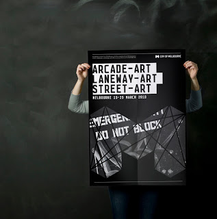
City of Melbourne//Jason Little
The designers of this branding were given a brief in which they were required to portray the vibrance of Melbourne city through the design, as well as demonstrate the dynamic, progressive city that it is. I think they have achieved exactly this with their cohesive branding strategy...
'At the heart of the new design, the bold “M” presents a full expression of the identity system - immediately recognizable and as multifaceted as the city itself: creative, cultural, sustainable. A celebration of diversity and personal interpretation that is both future-proof and iconic.'
ITI//Heydays
The bright bold branding design seen here gives the company it's own distinct identity, setting it apart from any other brand.
'ITI is a pioneer in automation technology, solving everyday challenges in all parts of life. With a clear strategic focus, ITI is making better life quality everywhere - in private life, corporate buildings, public space and healthcare. The brand communication we developed for ITI is built upon the business idea itself. Appearing different on every surface, the visual expression is a representation of life, freedom and possibilities. We established their core values and developed full visual identity program and slogan.'
Sebastian Burgold//Rene Bieder
The simplicity of the identity created for this brand allows it to be easily transported between products.
Trigger Oslo//Martin Stousland
Using the same visual language and colour palette an identity incorporating a range of personal signatures has been created. The colours used are inviting emphasising the companies 'welcoming approach' in contrast to the corporate identity which colours the rest of the brand.
Grun macht Frolich//Speck Visuelle Kommunikation
This is a very inventive way of creating a typeface suited to the brand in question. I like the way in which it uses a simple process yet appears very intricate.
Expatcenter Identity//Silo
The vibrant appearance of this brand's identity communicates a 'fun' motive to the audience through the use of both colour and pattern.
Ivan Hair Salon// G
The simple fact that the identity of the brand uses hair to relate to the hairdressing company enables it to be easily identified as a hairdressers.


No comments:
Post a Comment