I want to produce a document to explain my infographic designs, so I have decided to look into the layout and composition of exhibition catalogues.....
Exhibition: Joseph Miceli
This uses a simple design yet has the ability to effectively inform.
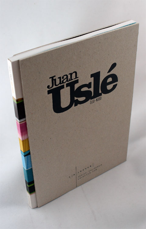
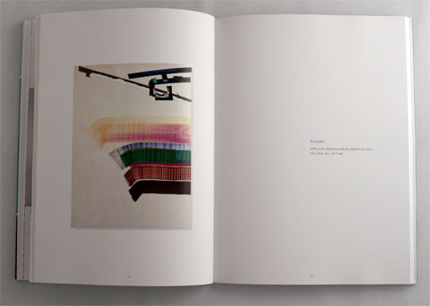
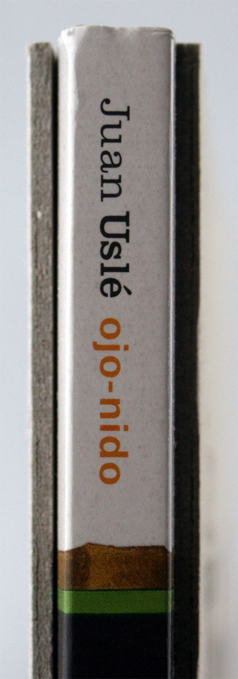
Juan Uslé: Ojo-Nido Exhibition Catalogue
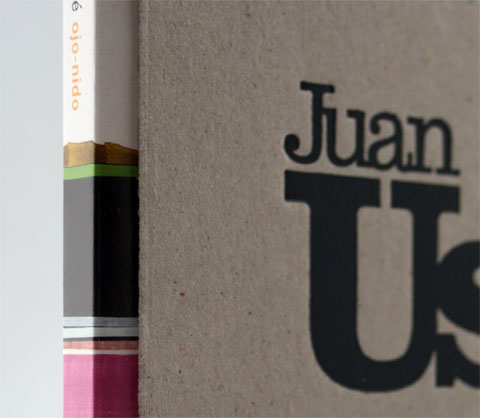
The use of colour in comparison to the drained colour of the board is refreshing and an eye-catcher at that.
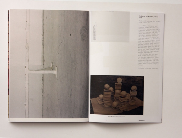
Phil Sayers and Sarah Pucill
A little book which plays with the layout, helping to create a sense of intrigue.



No comments:
Post a Comment