

Simple gradients between two colours seem to work well.

...the introduction of block colour into the gradient works well. This could work in having a solid colour block where I need to present text upon a gradient.

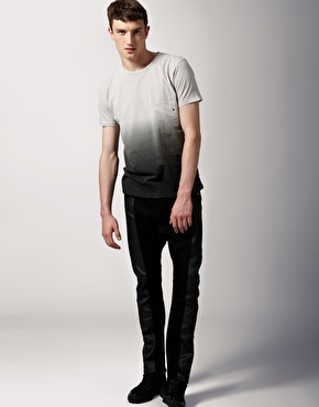
Using the darker gradient at the bottom of the t-shirt work well ...this would also work having the darkest colour of the gradient at the bottom of my screen.


...Using a gradient within an image also look effective. I could do this within the MoS logo design and present it again a block coloured background.


Using a pattern upon the gradient work well. A subtle MoS logo (lowered opacity) could be placed upon the gradient to create a stronger identity throughout my idents and title sequence.

It seems that colours close together on the colour wheel work better together on a gradient as they do not have as many colours to go through between the two colours.

The white type works well against the coloured background. I think it would work well against pretty much any gradient except for one that contains white as one of it's colours.
I also think that gradients which contain only two colours seem to look visually stronger than those which contain more than two colours to make up the gradient.
No comments:
Post a Comment