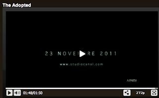
The downward way in which the type enters the screen and hits the white background as if it were hitting a floor creates a sense of drama.
The transition of the type between the frames are simple but they clearly communicate the message. The transitions mainly fade on to create a subtle introduction to the type.
The flashing between the inverted black and white colours and the changing type makes you concentrate on the type to see what it says. It is very effective.
The rippling way the type enters the screen at the end creates a sense of mystery, so much so that you want to continue to find out what its about and watch the film.
The logo transitions at the beginning of this is most interesting. The logo fades onto the screen through the clouds and progresses to move towards the camera. The logo the dissembles and moves further toward the screen. These transitions happen at a fast pace but it is well timed and all flows.


No comments:
Post a Comment