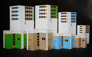
....this is exactly how I want to package my pencil!
Monday, 31 October 2011
WHAT IS GOOD... A bit of packaging

When researching for box packaging I came across this collection, I am loving the use of solid blocks of colour present within a lot of these.
WHAT IS GOOD... Medical Colours
I wanted to produce a design which subtly hinted at a medical aspect, so I researched and found that the general colour associated with the medical sector is this greeny/blue colour....
...as a result, I am going to try to use this colour within my work.
Saturday, 29 October 2011
WHAT IS GOOD... Modern and Vintage Medical Packaging.
These packaging designs have a modern feel due to the colours involved yet keep their purpose intact; you can still see they represent medical packaging.
The use of the bold yellow and orange colours allow the products to be established as medical packaging. I especially like the use of the typeface in the latter image, it is bold and therefore stands out from the rest of the writing.
WHAT IS GOOD...What can you get from writing?
This blog asks the question 'what can you get from writing' and opens it up for people to answer. Some very interesting responses.
WHAT IS GOOD ...Large Scale Advertising
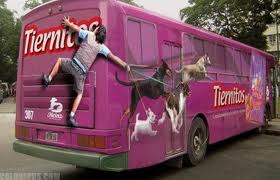
Bus Design...
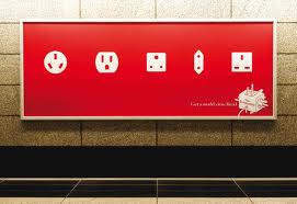
Bill board design...
Telephone box design...
Bus stop design...
Building advertising...
Other advertising techniques...
Researching into these bigger scale techniques for advertising have got me thinking about how I can go about advertising my product in a slightly different manner.
Subscribe to:
Comments (Atom)


