
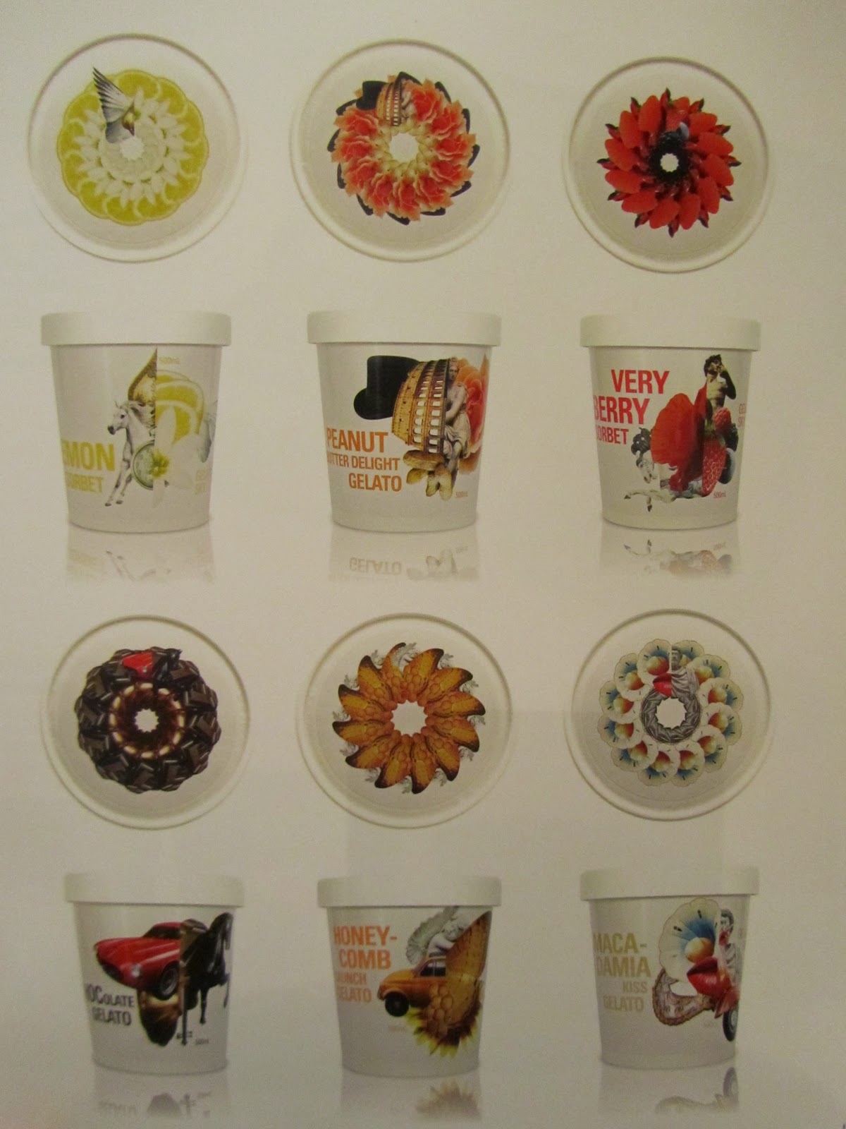
From the book 'packaging design' these designs stood out for me and influenced my design decisions.


The triangle here works well with the angular shapes produced by the packaging. It is simple but incredibly effective.


The subtle embossing present upon this packaging gives it a sense of deluxe.

I am drawn to the illustrative element here, it is an alternative to the clean cut graphical packaging I have been looking at.


I think the simple colour combination here works really well here; one colour plus black and white.


The unusual application of the label sets this packaging apart from standard packaging.

The monotone angular shapes created here work well against the varying colours of wine in the transparent bottles.

The delicate infusion of colours turns this transparent bottle into something a little more.

An interactive packaging design ...i like!

The colour combination works extremely well here.


Love the varying colour combinations and the fact that each colour represents a different flavour of tea.


No comments:
Post a Comment